
Want a quick overview?
About the project
DirecTV allows customers to manage all aspects of their account online. They have noted seeing a shift from the traditional desktop web experience to a mobile view. The problem that we are tasked with is to make it easier for users to manage their streaming TV package on a mobile device (web).
My contribution
Competitive analysis research
Low/Medium/High fidelity prototypes and wireframes
Design workshops and focus sessions
Usability testing with target users
What did I learn?
Presenting your design project to stakeholders or clients is a crucial aspect of the design process. I learned how to effectively communicate my ideas, present my work professionally, and tell a compelling story about my design choices.
Here's a brief summary that takes only one minute to read
Phase 1: Exploratory Research
How can we make it easier for users to manage their streaming TV package on a mobile device?
Problem Statement
Four main user goals
We were tasked by the DirecTV team to address four major goals that users have when they are using the account management functionalities.
Note: During this project we were not able to use DirecTV or other streaming services branding in our prototype. The logos and names of the services in the prototype are fictional.
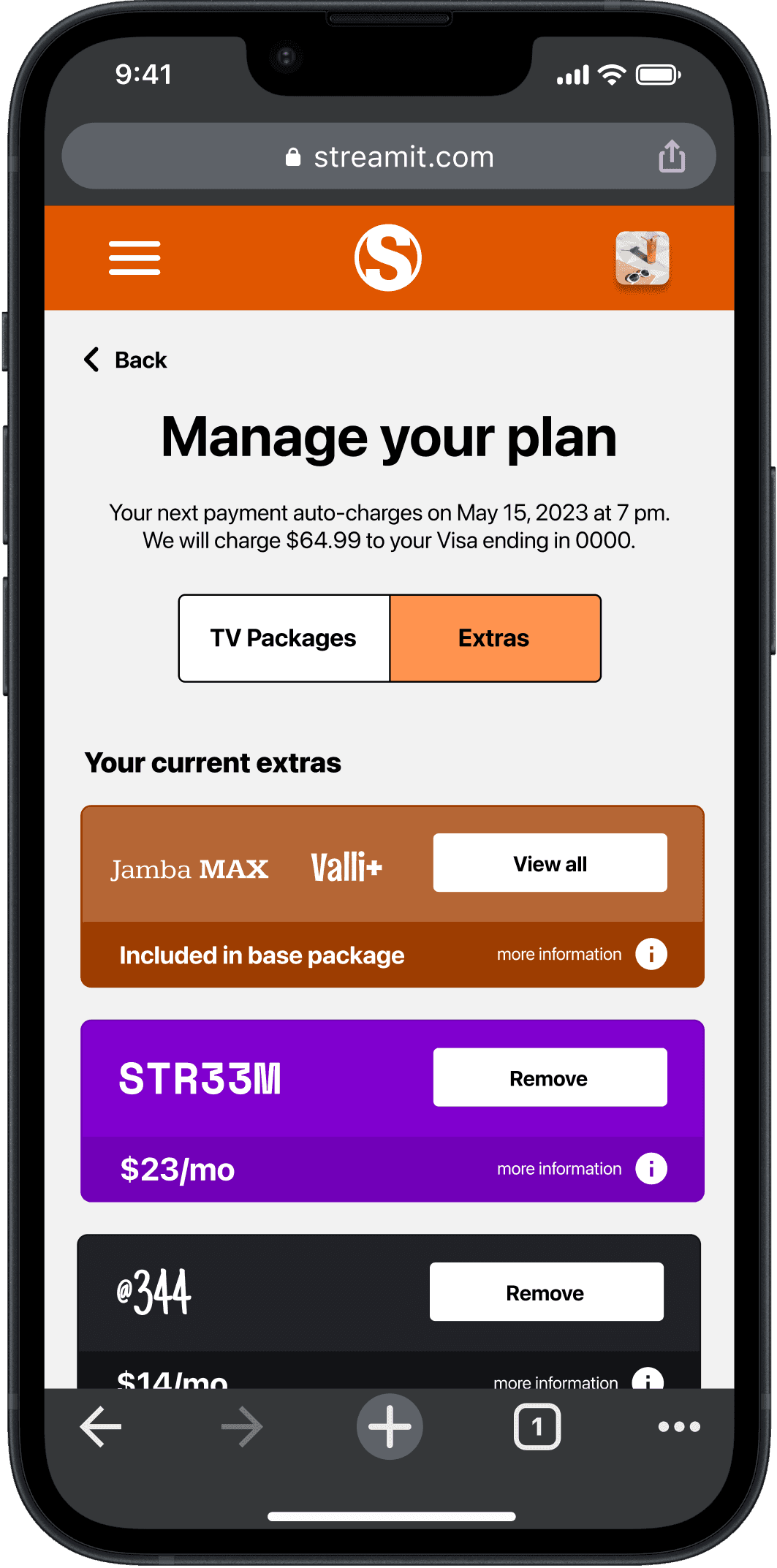
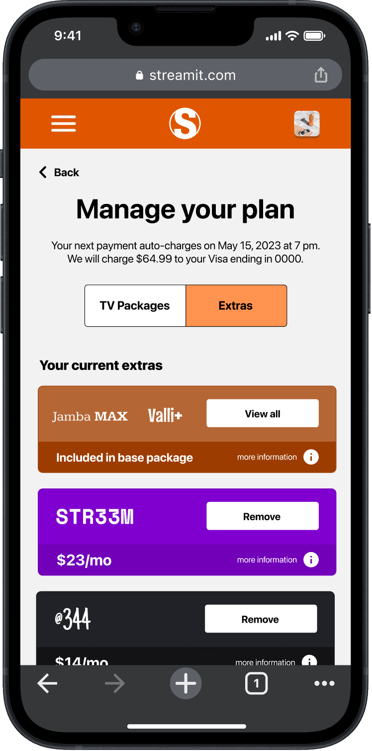
Add or remove a premium channel, sports package or subscription service to an existing base package
Compare package/add on pricing once the customer has made adjustments
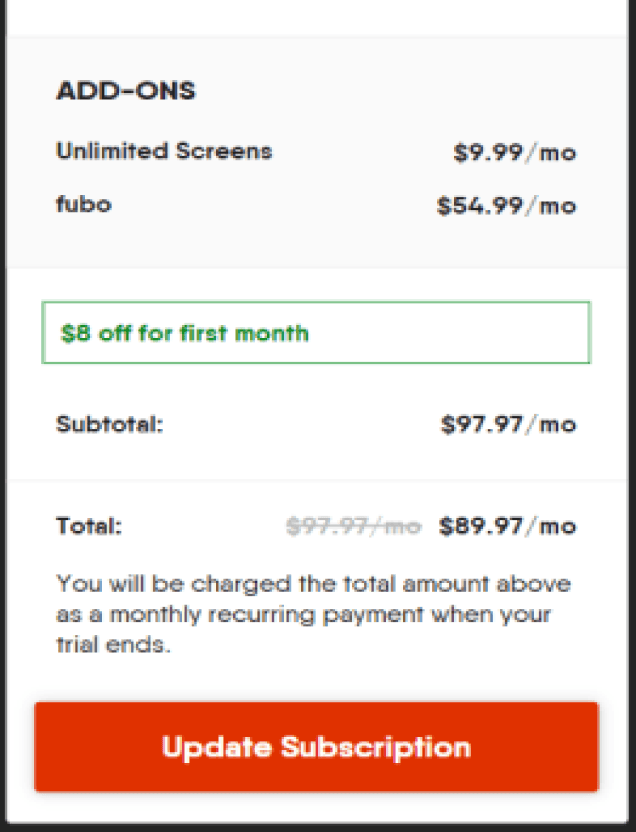
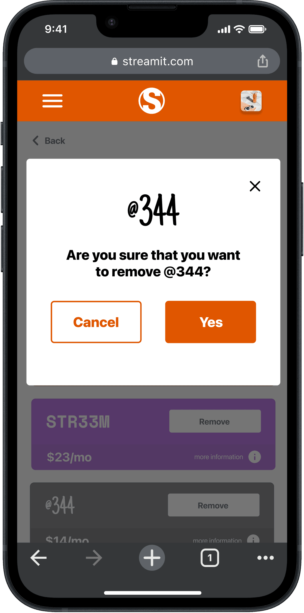
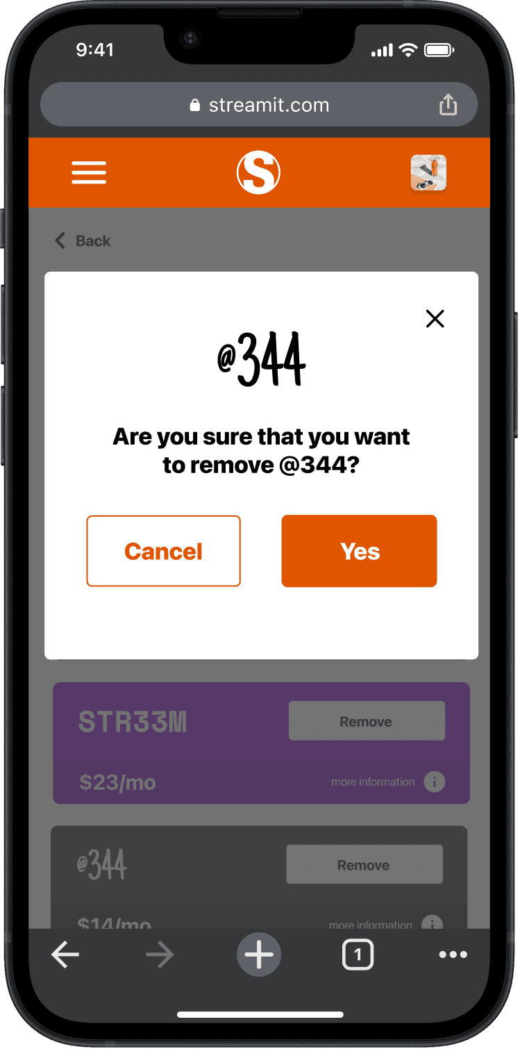
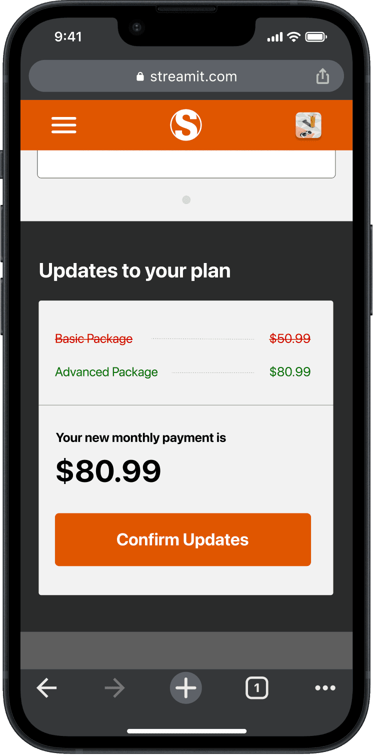
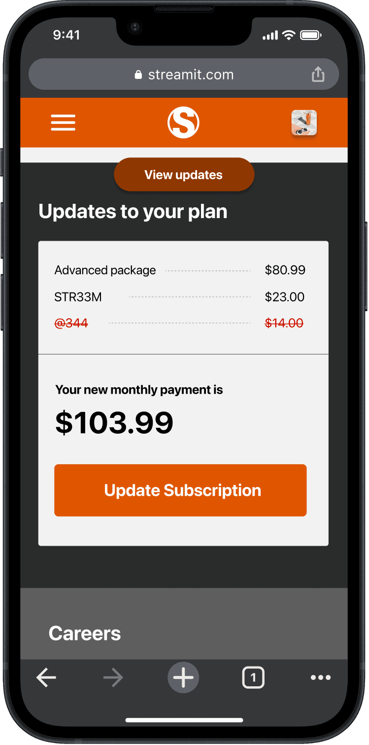
Review and commit to the changes made
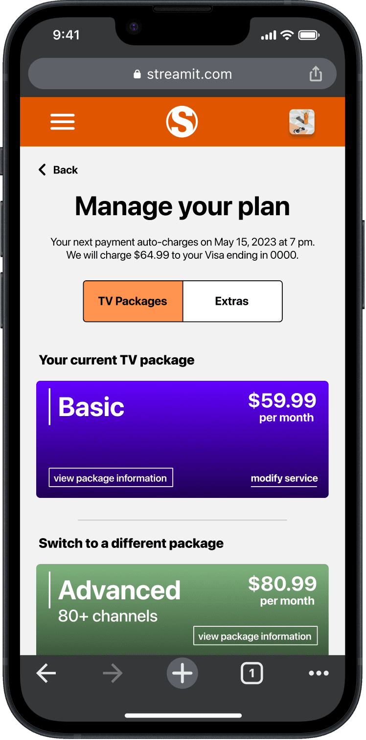
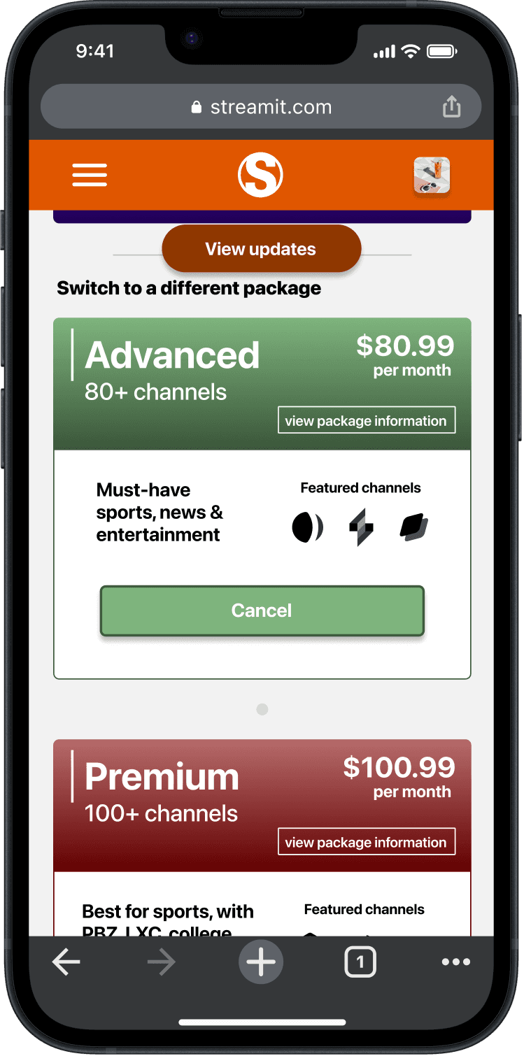
Upgrade or downgrade base package
Competitive analysis focus
Visibility of system status
User control and freedom
Error prevention
Flexibility and efficiency of use
Cognitive load and simplicity
We reviewed three similar services on the following criteria:


Hulu - minimal and simple visual design, flexible navigation
Fubo - dynamic change for price/package comparisons
Sling - most efficient space usage for dense content
Consistencies between the services included:
Utilizing a card design
Toggle based interactions
Confirmation of changes
Language of “Add-ons”
Long vertical scrolling

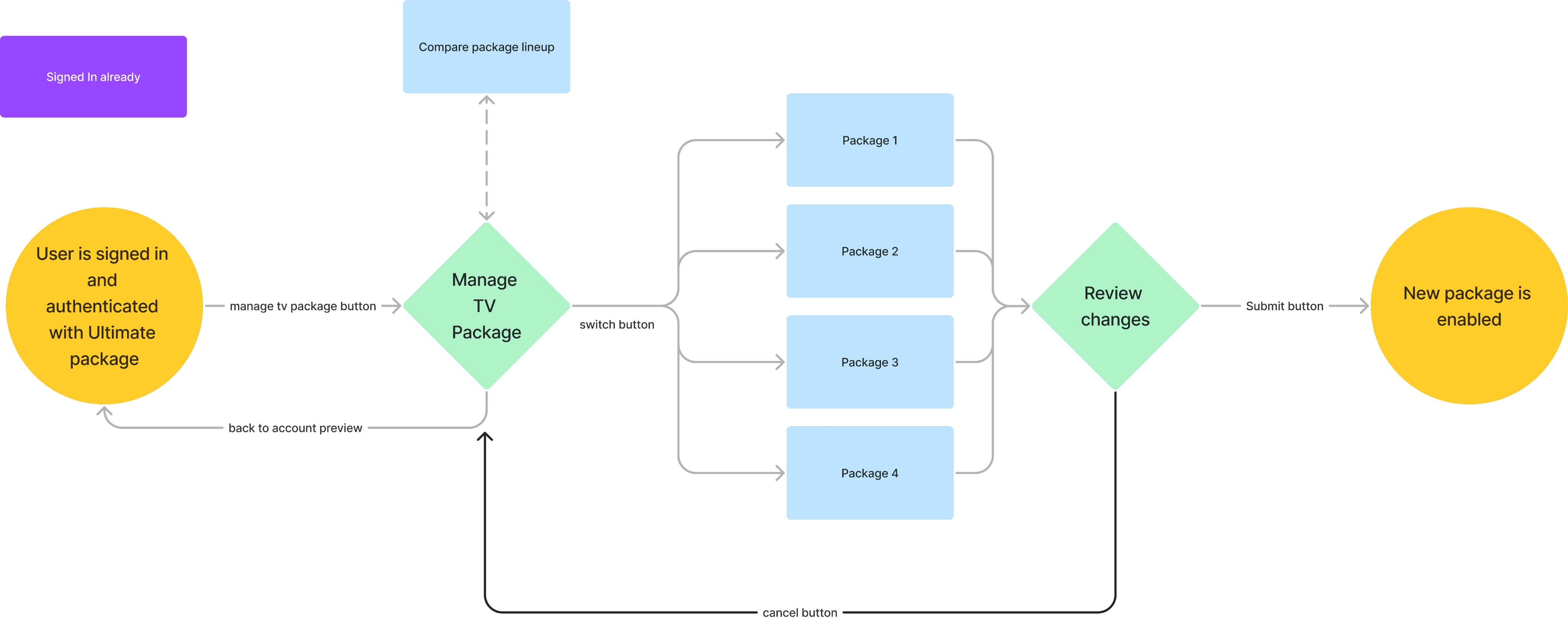
Task Flow: Upgrade or downgrade the base package
As-is task flows
Task Flow: Add or remove a premium channel, sports package or subscription service to a base package

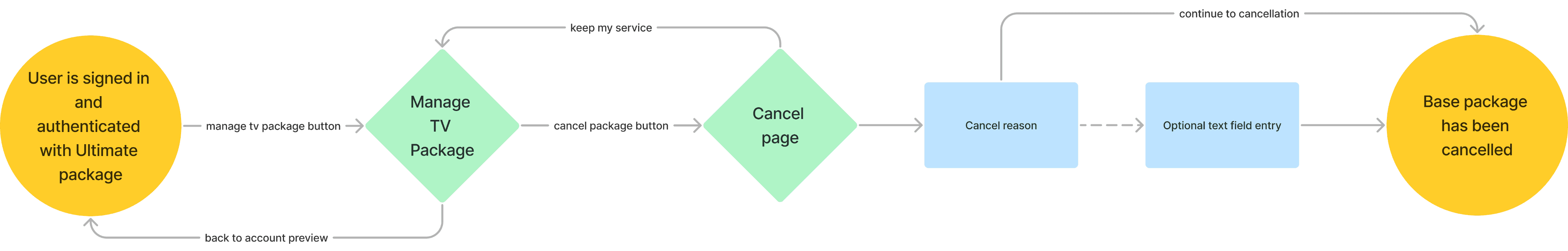
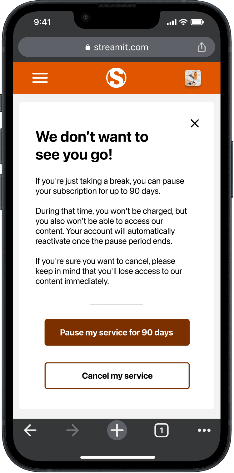
Task Flow: Cancel a package
Phase 2: Design Kickoff
We started off with low fidelity greyscale prototypes to understand how the interactions of the proposed design felt. We used these designs to conduct a first round of usability tests, wireframe walkthroughs and design critiques.
Focus group with low fidelity designs
Updates to the prototype were influenced by our focus group session:
Showing the addition/subtraction of certain packages and extras
Adding text description to TV packages
Switching the “cart” for something easier to understand
Moving onto medium fidelity
Now that we had some insights on our basic prototype it was time to add interactions and give the prototype more life with color. We chose orange as the main color to promote users ability to express themselves freely and differentiate ourselves from DirecTV and other services.
Phase 3: Prototype evaluation
In the next phase of the project, we evaluated the designs with users to get valuable feedback.
Do users understand the system?
Do users understand how to complete the tasks?
Which tasks and features are user-friendly?
Which tasks and features need improvements?
How to users perceive this experience?
01
02
03
04
05
Evaluation research objectives
7 Student participants
5 Working professional participants
Participant Details
24-65
Age range
7 Sessions with mobile device
5 Sessions with laptop
Session Details
12
Sessions
30-60 Minutes Each
Usability participants
Task 1: Find package information & switch packages
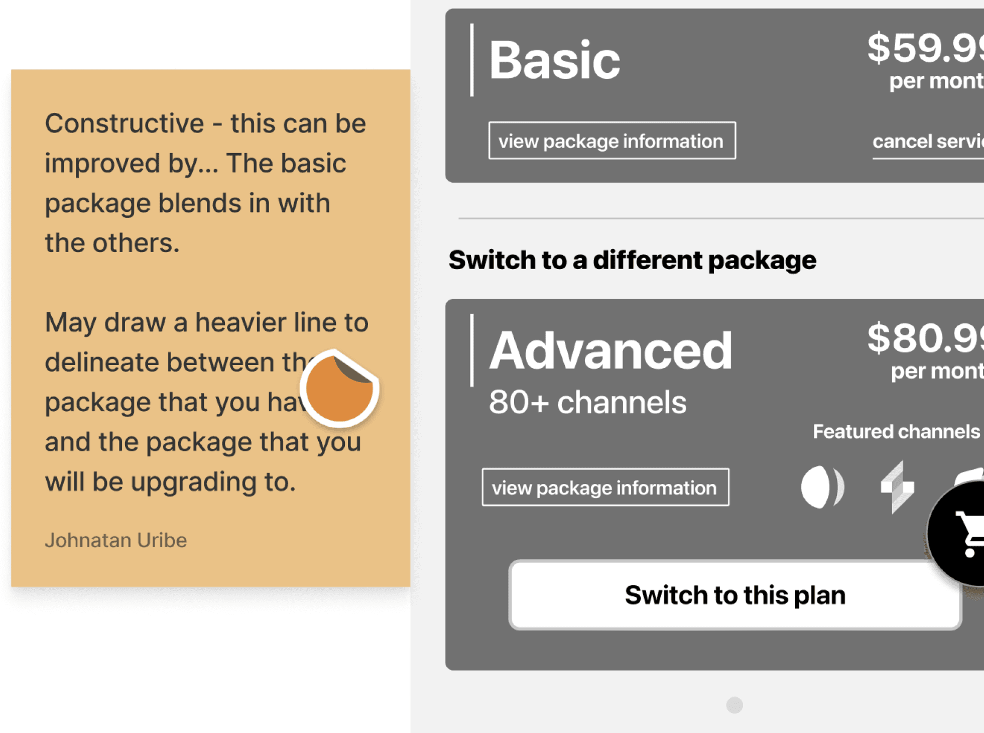
The good
Clear initial language and buttons
Information present met users expectations
Users had no issues comparing packages
The not so good
State changes did not meet expectations
Cancel terminology confused users
Non-uniform graphical elements (view package info button alignment)
Usability task analysis
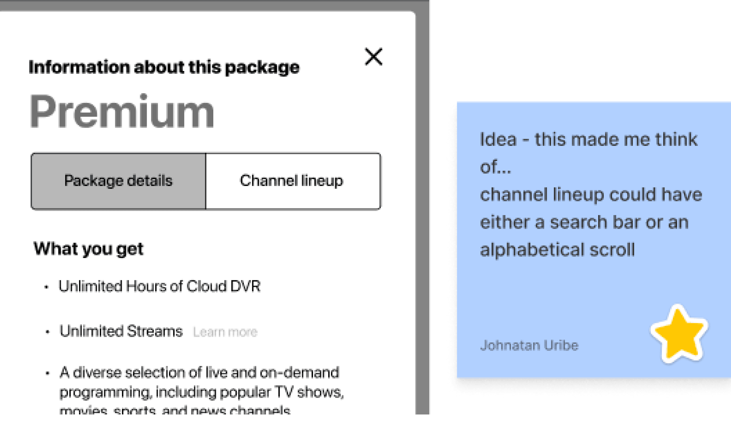
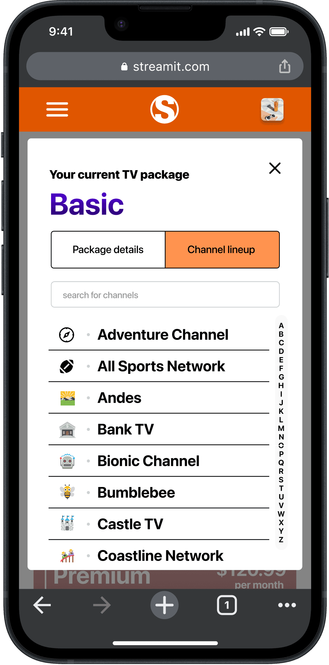
Task 2: Adding/removing channels (add-ons/extras)
The good
Users navigated here easily
Finding the channels was efficient
The not so good
Confusion around where the channels came from
Cards do not match the package card designs
Users expected changes to take place as soon as the pop-up confirmation was completed
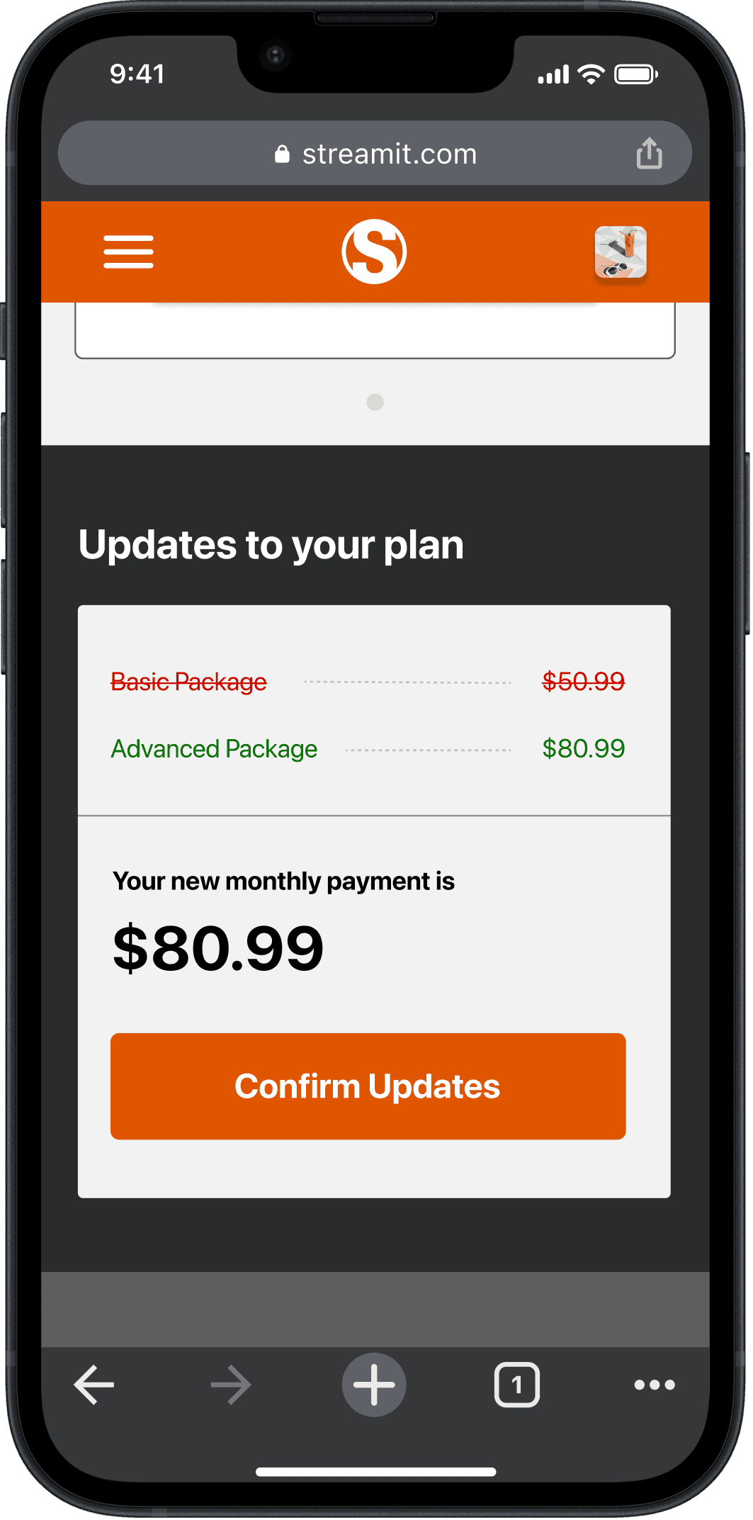
Task 3: Compare changes made in system
The good
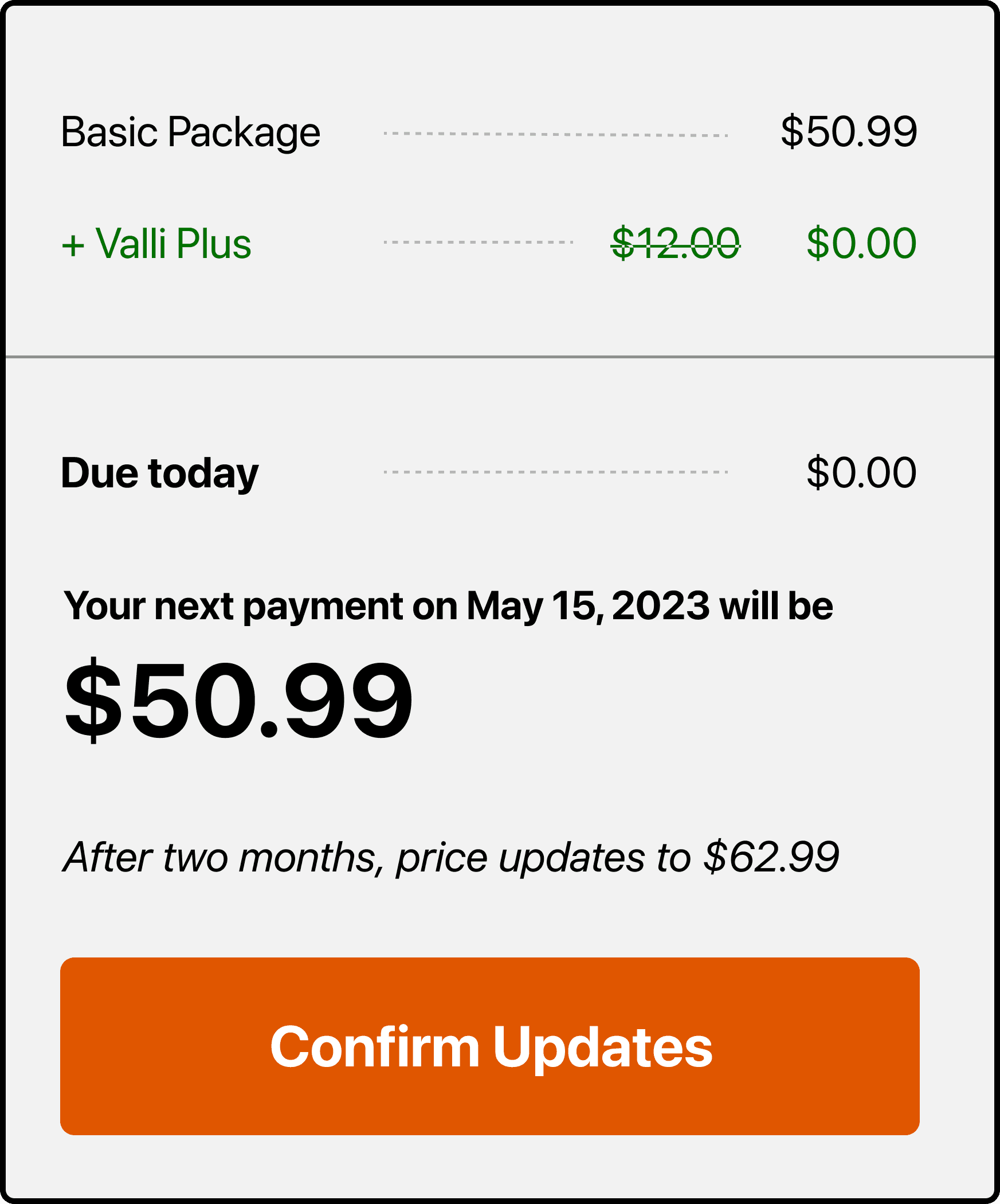
Users unanimously liked the color coding and strikethrough to see changes
Clear language and understanding from users
The not so good
“View Update” button remains even when viewing update
Unclear when these changes would be enacted (dates/times)
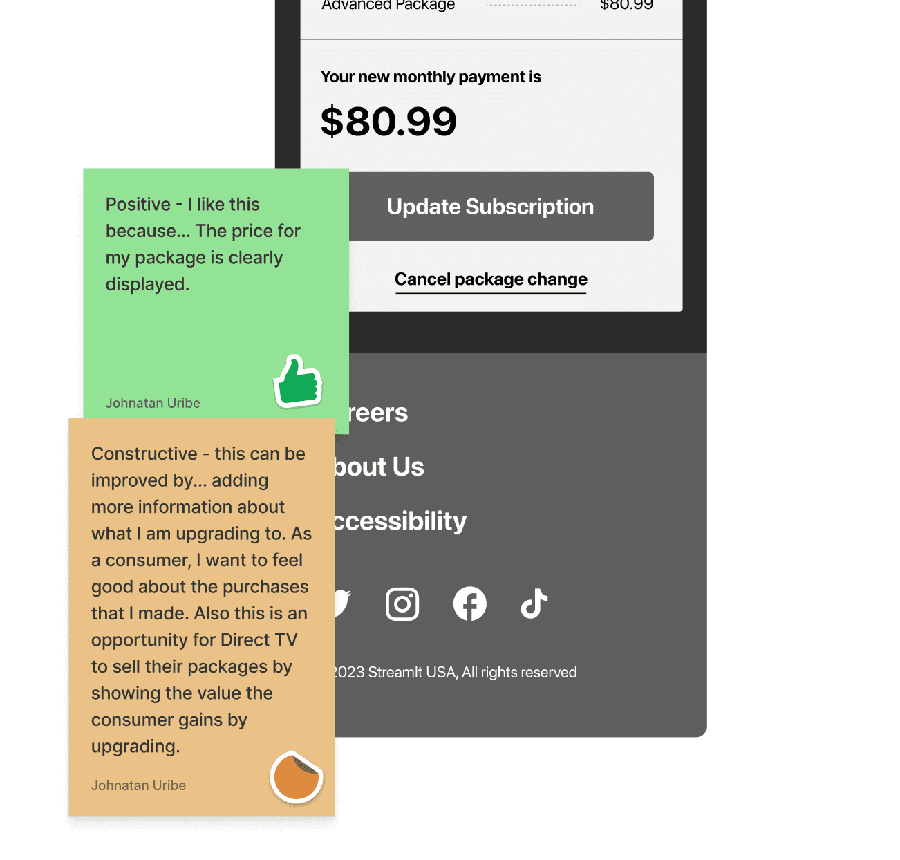
Task 4: Review & Commit to Changes
The good
Users felt this step followed convention
No users had problems navigating this task
The not so good
Users were unsure if this would commit the changes
Unclear when these changes would be enacted (dates/times)
Users wanted another confirmation after they hit “Update Subscription”

Updates for high fidelity
To finish out the project we made adjustments to the prototype based on the usability feedback.
Working with an industry partner
Working with an industry partner requires clear communication, alignment of objectives, and flexibility to adapt to changing needs. Leveraging each other's strengths, handling intellectual property, and risk management are crucial for project success.
Be creative
Embracing creativity in a project is crucial as it fuels innovation, encourages problem-solving with unique perspectives, and leads to more engaging and effective solutions that can distinguish the project outcomes from conventional approaches.
Communication is key
Effective communication among team members and stakeholders is critical. This includes being transparent about progress, challenges, and changes.
Project takeaways

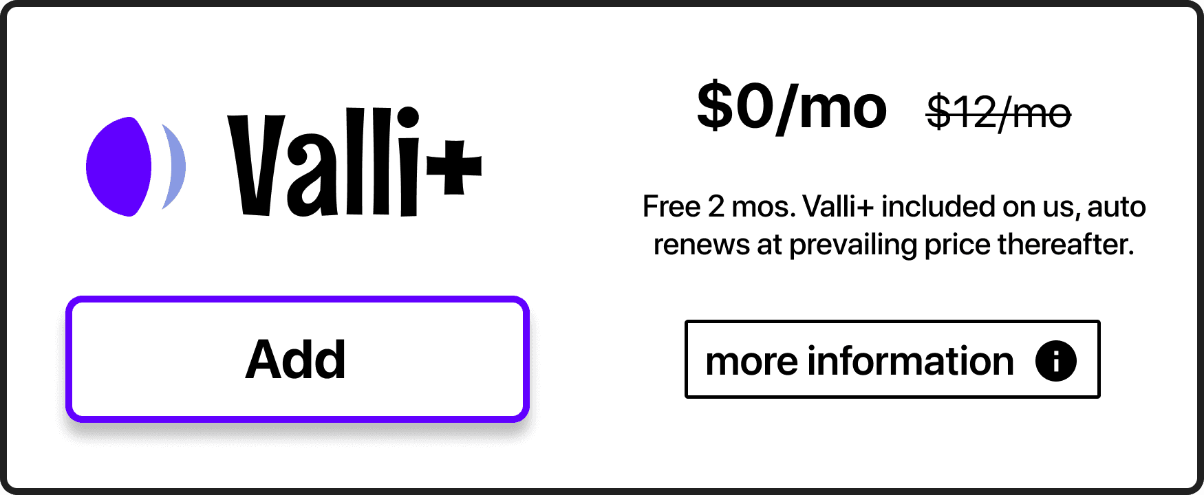
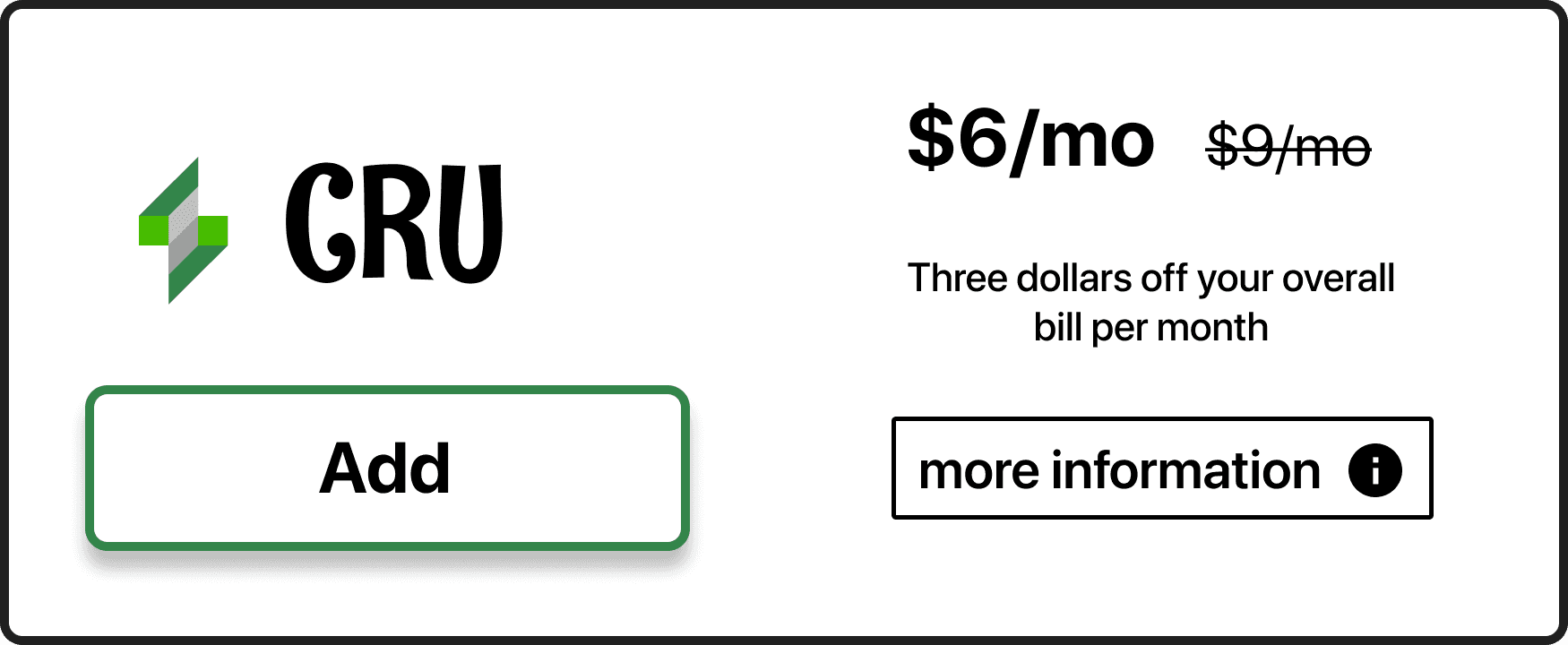
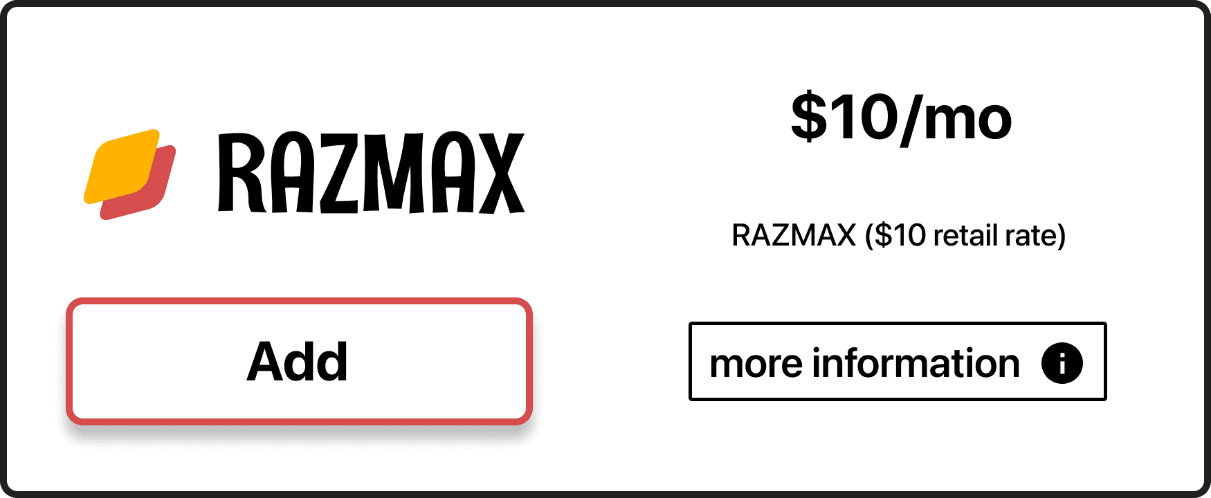
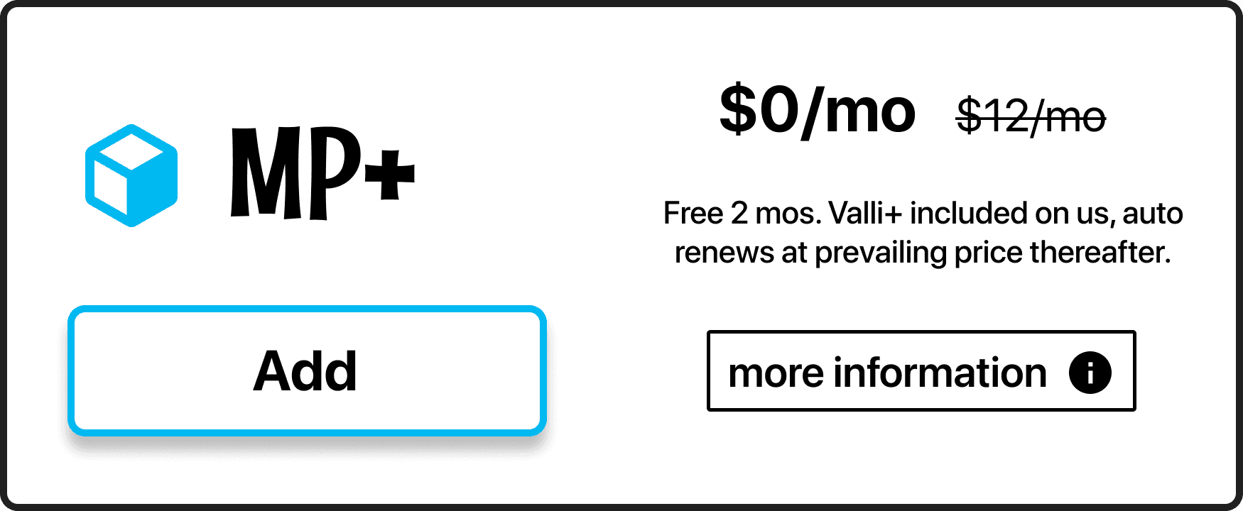
Updated add-on card style
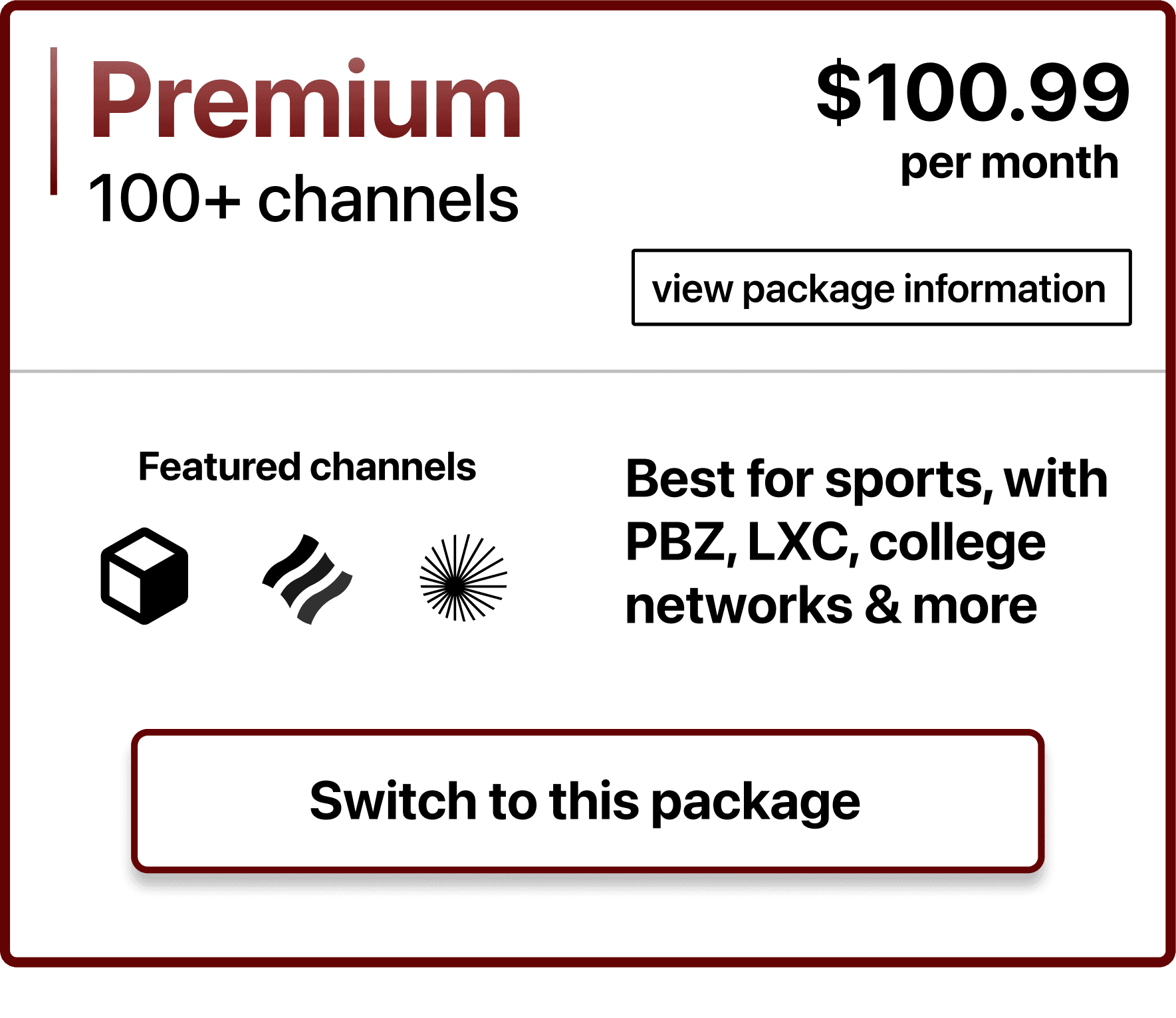
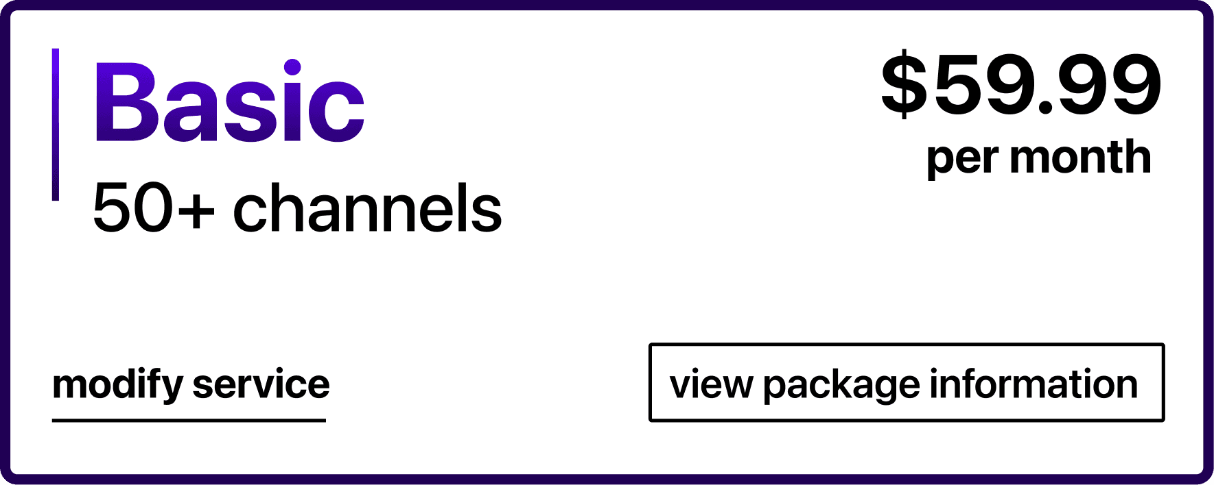
Updated package and checkout card style