Emory Healthcare
August 2022 - April 2023
Sponsor
Emory Healthcare
Team and Responsibilities
Maxwell Nelson - Lead Designer
Maria-Paula Lengua Espejo - Lead Researcher
Tools
Figma, Notion, Google Sheets, Miro
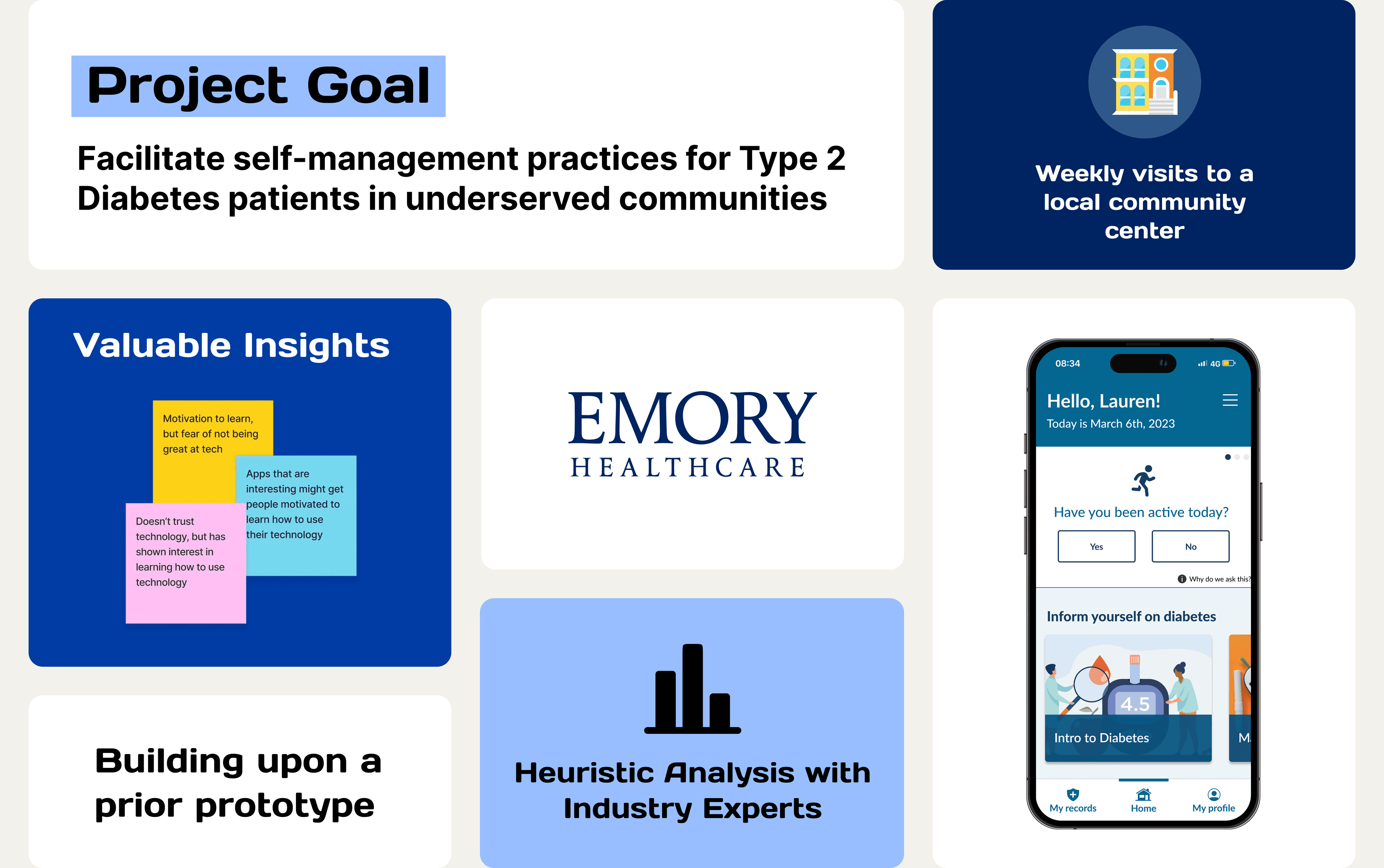
How can we use technology to facilitate self-management practices in patients with Type 2 Diabetes who live in underserved communities?
The Centers for Disease Control and Prevention (CDC) identifies diabetes as one of the leading causes of death in the United States. Its impact has grown disproportionately within underrepresented communities, driven by limited access to healthcare, low health and technology literacy, and a range of sociocultural factors.
To better understand these challenges and design more inclusive solutions, we conducted weekly sessions at a local community center, engaging directly with community members to gather insights and inform our approach.
Exploratory Research
- Literature Review
- Field Observations
- Persona Creation
Existing Prototype Evaluation
- Heuristics Evaluation
- Pilot Study
- Mid-Fi Prototype
Redesign and Evaluation
- Design Updates
- Usability Testing
- Expert Testing
Project Takeaways
Giving back to the community
Our weekly visits to the community center made a significant impression on us, and the seeing the residents' smiles after we assisted them was great!
Gained experience designing for underserved communities
By getting to design for a population that has limited access to technology, we were able to understand exactly how to help them best.
Real-life project solution
As we have established a genuine connection with the individuals at the community center, it would be great if the app could be developed to assist them.
Phase 1: Exploratory Research
Literature findings
Diabetes in underserved communities
Poor self-management practices are a result of low health literacy and barriers to education
Access to technology
Applications on the market and other high-tech devices are normally only accessible to a higher income population
Technology literacy
Current health applications on the market require high-tech literacy which becomes a barrier for adoption with marginalized populations
Field Observations
In August of 2022, we began hosting weekly "technology support" sessions for residents of a local Atlanta affordable housing apartment.
The community center is home to low and moderate income seniors and families.
Over the course of the year we held 28 sessions and analyzed observations from the first 12 weeks.

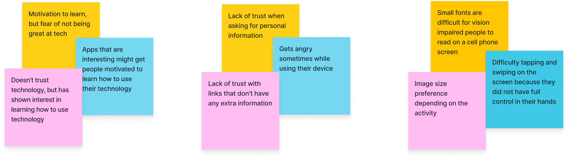
Each session we would note:
Observation findings
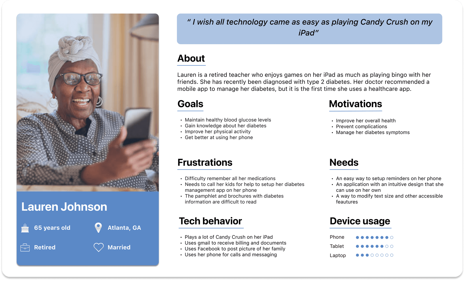
Persona creation
Goal
Help build empathy for participants that don't have T2 diabetes and with a higher tech literacy
Method
Persona was built based on observations and literature
Phase 2: Existing Prototype Evaluation
We evaluated the prototype that a prior team completed in order to make improvements and create efficiencies where possible.
We decided to evaluate the prototype in two ways:

Heuristics evaluation
Pilot study
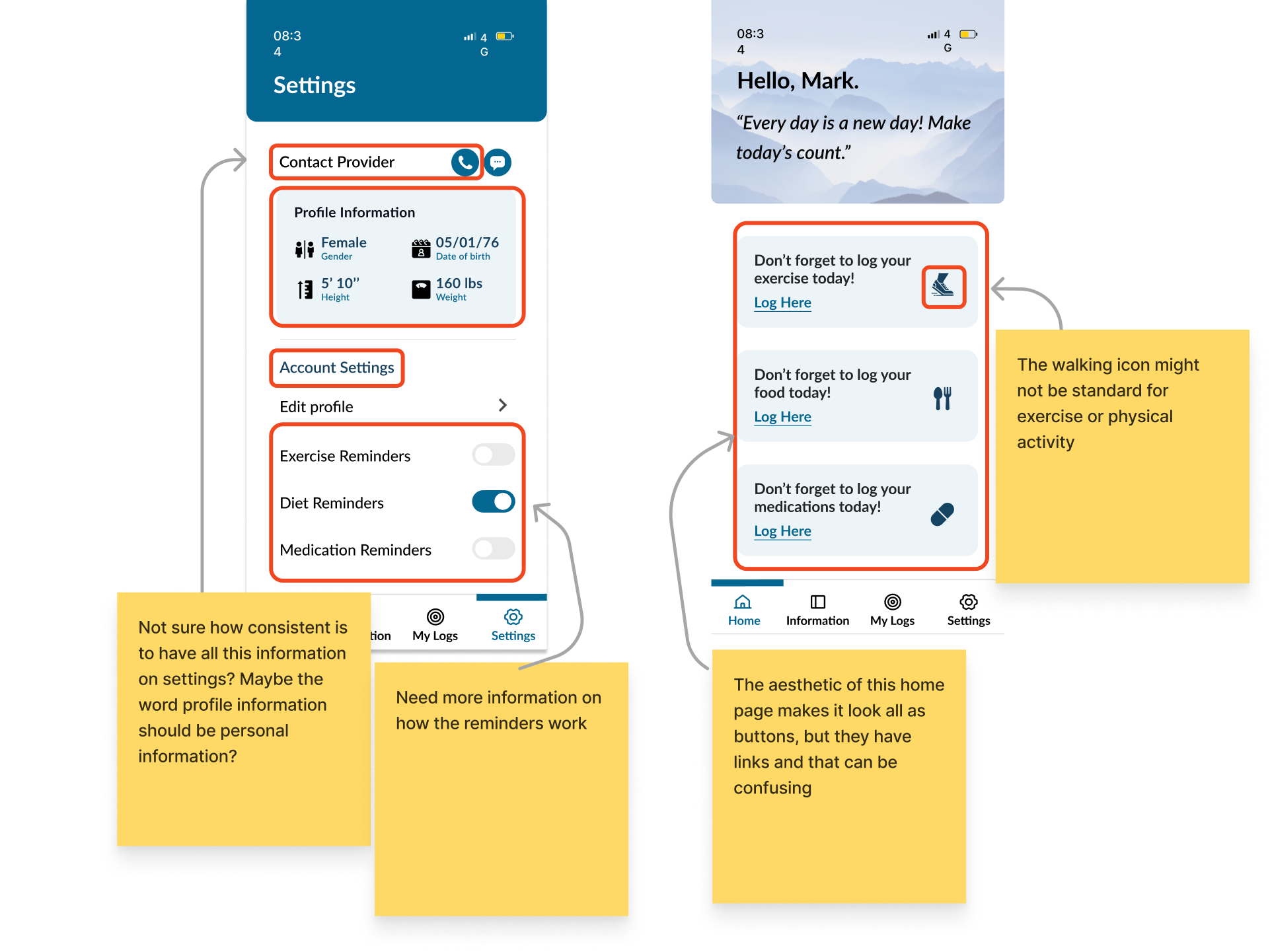
Heuristics evaluation
Goal
Validate design requirements and uncover design issues
Method
Used 10 Nielsen Heuristics and knowledge from observations
Changes needed to improve design:
Aesthetic and minimalistic design
Focus on clean, uncluttered interfaces with clear visual hierarchy
Consistency and standards
Maintain uniform design patterns and follow platform conventions
Help and documentation
Provide accessible guidance and clear instructions for users
Pilot Study
Goal
Test prototype and gain feedback for future iterations. Observe paths and taps users take to improve navigation.
Method
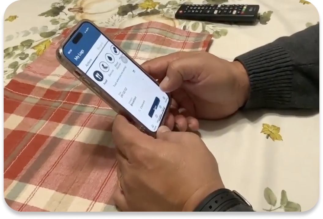
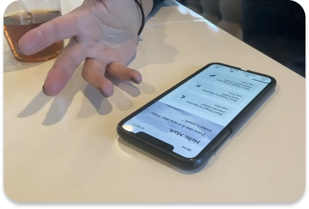
In-person think-aloud scenario task based testing
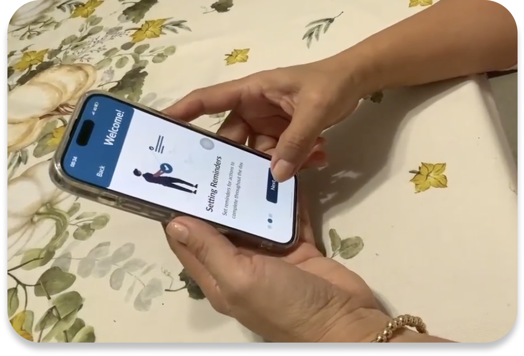
Task 1: Complete Onboarding
Gather thoughts on the language and whether it aligns with their anticipated experience of the application.
Task 2: Profile and preferences
Assess the user-friendliness of the existing menu's information architecture.
Task 3: Information about diabetes
Gain insights into the discoverability, significance of topics, and readability of the articles.
Task 4: Enter food information on logs
Determine whether the language (UX writing) and form design are simple and effortless to use.
Key insights from heuristics and pilot test
Personal Information
Add notices of why we are asking personal information
Unexpected Locations
Profile section and preferences are not expected to be in settings
UX Writing
The word “logs” does not convey tracking actions, and “information” doesnt fully convey articles.
"Information here. Oh no settings. Here, profile information and reminders? I think it is to change color and letter size?"
- Participant 2, Translated from Spanish
"My logs? It wasnt a familiar word, I would name it my routine. Sounds better"
- Participant 4, Translated from Spanish
Phase 3: Redesign and evaluation
Design Updates
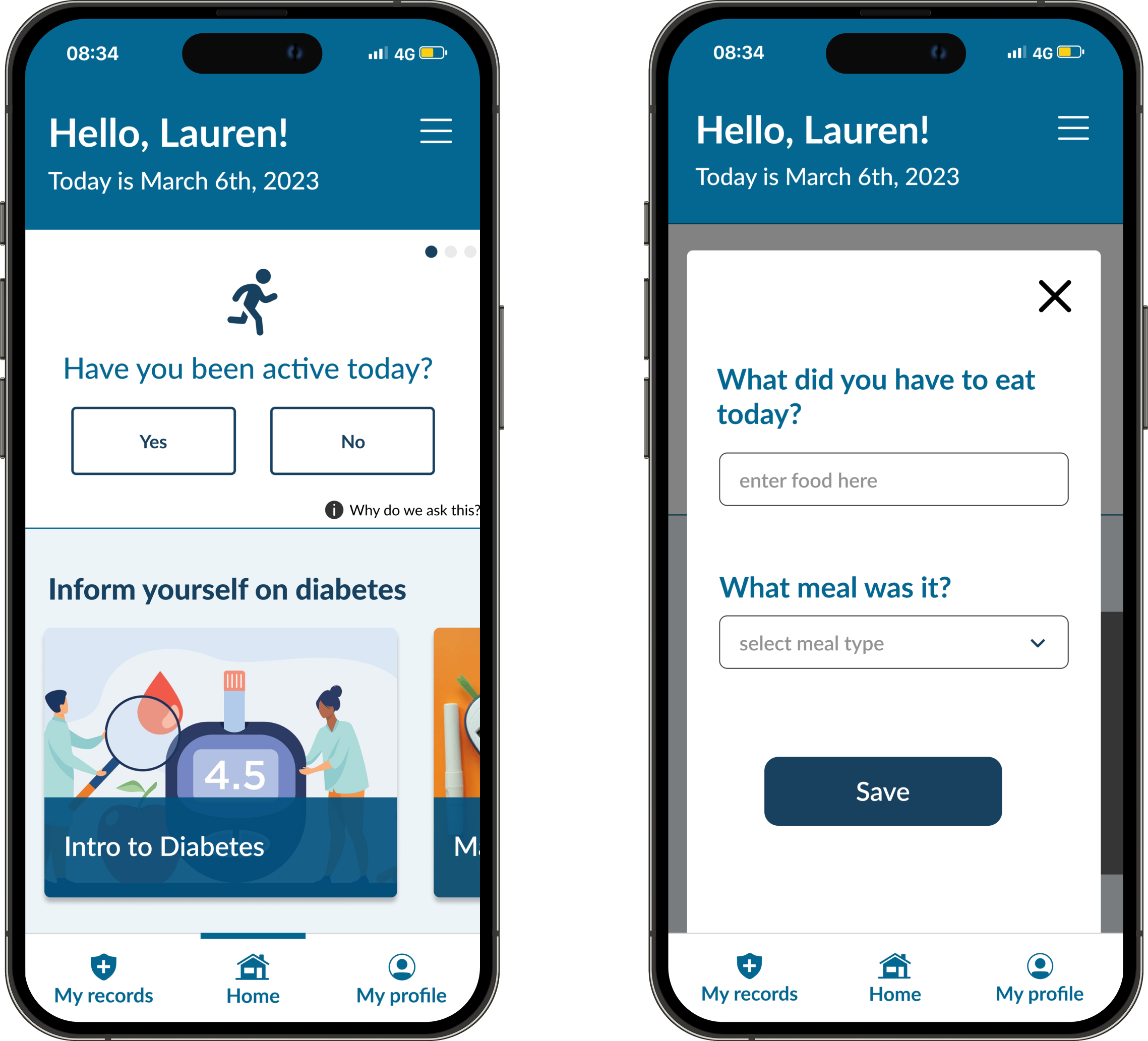
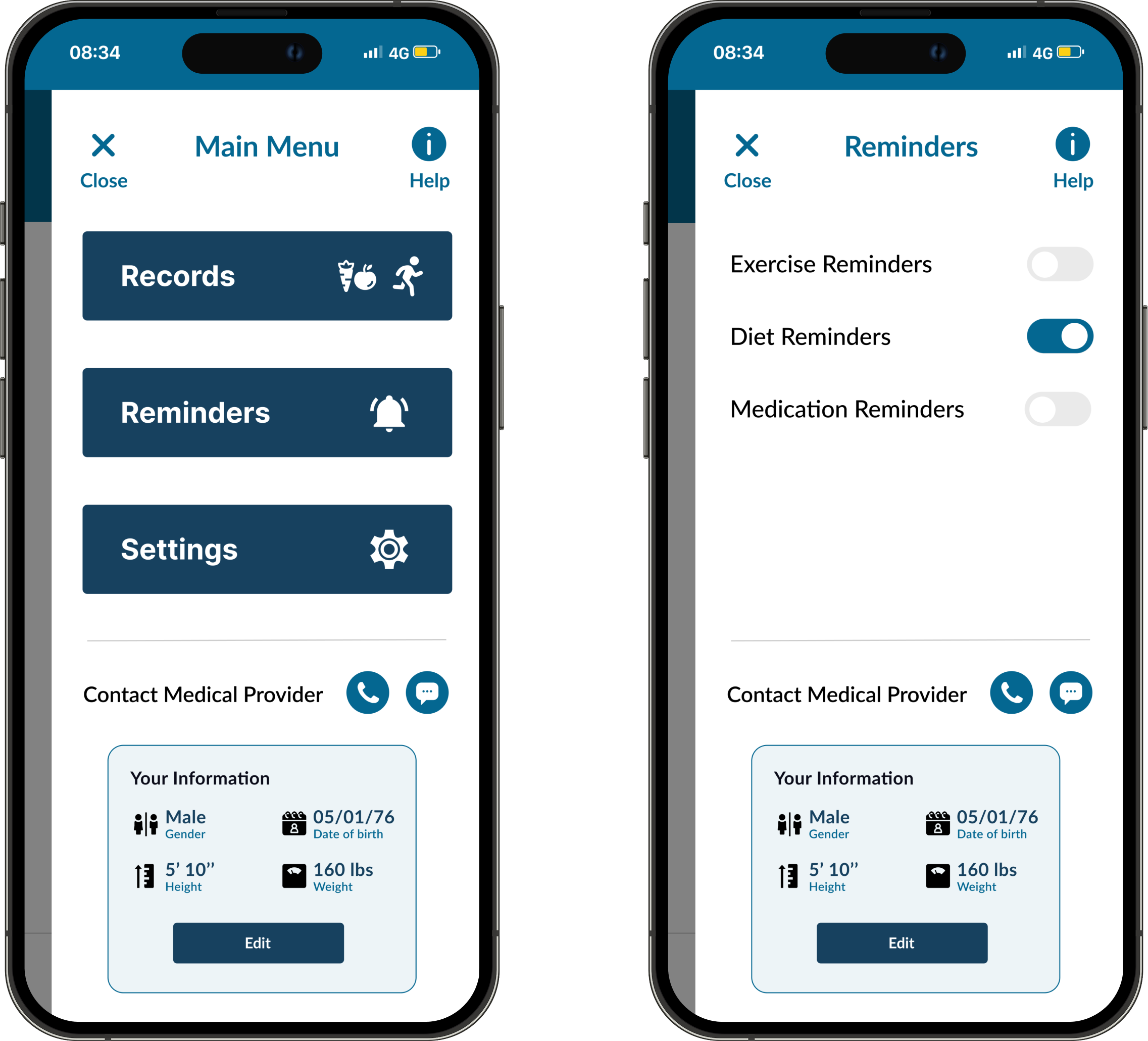
Based on our research findings and user feedback, we implemented several key design updates to improve the overall user experience and address specific pain points identified during testing.
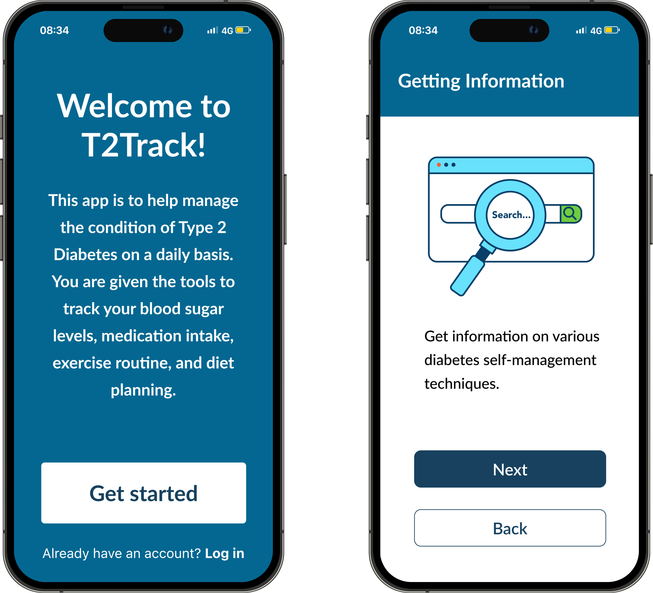
Simplified Appointment Flow
We streamlined the appointment scheduling process by reducing the number of steps required and implementing a more intuitive calendar interface that clearly indicates available time slots.
Enhanced Status Indicators
Clear visual indicators now show appointment status (confirmed, pending, or completed) to address user confusion about appointment confirmation states.
Improved Refill Progress Tracking
We redesigned the prescription refill interface to provide clearer status updates and estimated pickup times, addressing user confusion about when medications would be ready.
Contextual Action Buttons
Action buttons now dynamically update based on prescription status, eliminating confusion caused by the persistent "Refill Status" button that remained even when viewing status information.
Enhanced Messaging Features
We added clear file attachment options and visual indicators to make it easier for users to include medical documents in their messages to healthcare providers.
Response Time Expectations
Each message thread now includes estimated response times based on provider availability, addressing user uncertainty about when to expect replies to their inquiries.
Usability Testing
Goals
Evaluate iterations made to designs from pilot feedback and gather input from members of the community center to incorporate their feedback into the subsequent iteration
Method
In-person 45 min think-aloud 4 task based session
Participants
Three senior residents (all female), age 65+
Task 1: Onboarding
Task 2: Setup reminders
Task 3: Find diabetes information
Task 4: Enter records
Usability Analysis
Our usability testing revealed specific insights across the four key tasks we evaluated. Each task provided valuable feedback that informed our final design decisions:
Task 1: Onboarding
All of the users accomplished the task and found it easy and familiar, and some expressed feelings of trust.

Task 2: Setup Reminders
Only one user accomplished the task while the other two were not able to discover reminders on their own.

Task 3: Find Diabetes Information
All users were able to accomplish the task and mentioned that they didnt have difficulty reading, but that speech-to text could be helpful too.

Task 4: Enter Records
All users were able to complete the task, although it took them some time to explore.

Expert testing
Goals
Speak with UX accessibility and health industry experts to refine the experience.
Draw a comparison between the perceptions of our target audience regarding the application and the opinions of experts.
Method
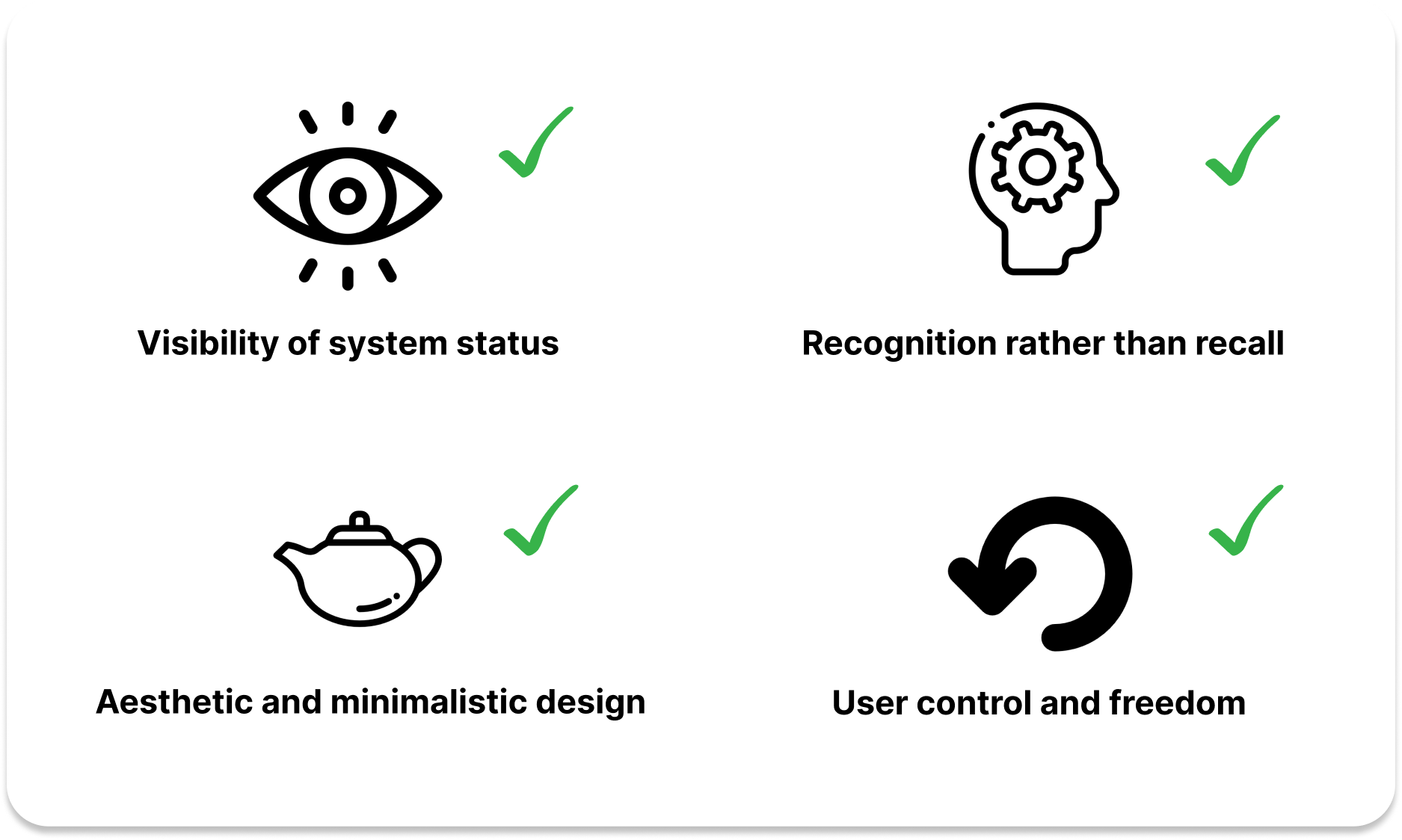
In-person 30 minute heuristic evaluation focus on 7 of Nielsen's 10 heuristics
Project Takeaways
Giving back to the community
Our weekly visits to the community center made a significant impression on us, and the seeing the residents' smiles after we assisted them was great!
Gained experience designing for underserved communities
By getting to design for a population that has limited access to technology, we were able to understand exactly how to help them best.
Real-life project solution
As we have established a genuine connection with the individuals at the community center, it would be great if the app could be developed to assist them.